Getting Acquainted with the Data
Starting Process
We found a dataset on kaggle.com of MLB position player statistics and salary data (adjusted for inflation) for 1985-2016. The dataset comprises 15023 observations with 29 features (4 ID features, 2 salary features, 4 fielding features, 19 offensive features). We focused on the adjusted salary as our dependent variable. After cleaning the dataset to remove some errant duplicates, we had 15014 observations, 25 independent variables, 1 dependent variable.
Making Assumptions
We had to assume that the creator of our Kaggle.com dataset applied the inflation adjustment correctly. We know that his original source for the data was a well-established baseball database created by Sean Lahman. The dataset had some oddities which required decisions:
- There was a 0 salary (which made taking the logarithm problematic) and one low outlier at $19,522. We deleted both rows!
- 8 duplicate rows were deleted
- Rookies (0-3 years service in league) do not have any negotiating power when it comes to salaries. There is a minimum salary in the MLB, so rookies will get at LEAST this amount, but may get more depending on the team they sign with.
- Beyond rookie, not yet a free agent (3-6 years of service in league) are eligible for salary arbitration if they believe their contract is underpriced.
- Free agents (>6 years service in league) can choose any contract offer tendered (e.g., from the highest bidding club).
We attempted to filter out every player's first 3 career years from the dataset to address this issue. When we aggregated the data in our improved linear regression the issue became moot, since we took the mean of all career year stats for every player. The salary range caused an issue as well … at the low end (after outlier removal) salary started at $136,734. At the high end, $39,810,209!
Of course when we plotted the histogram of salaries it was very “left-skewed” with a long rightward tail. Based on a suggestion in a Moneyball-themed post on Medium.com, we transformed the adjusted salary into its natural logarithm, thereby making the histogram distribution look more like a normal, Gaussian distribution.
Back to the Drawingboard
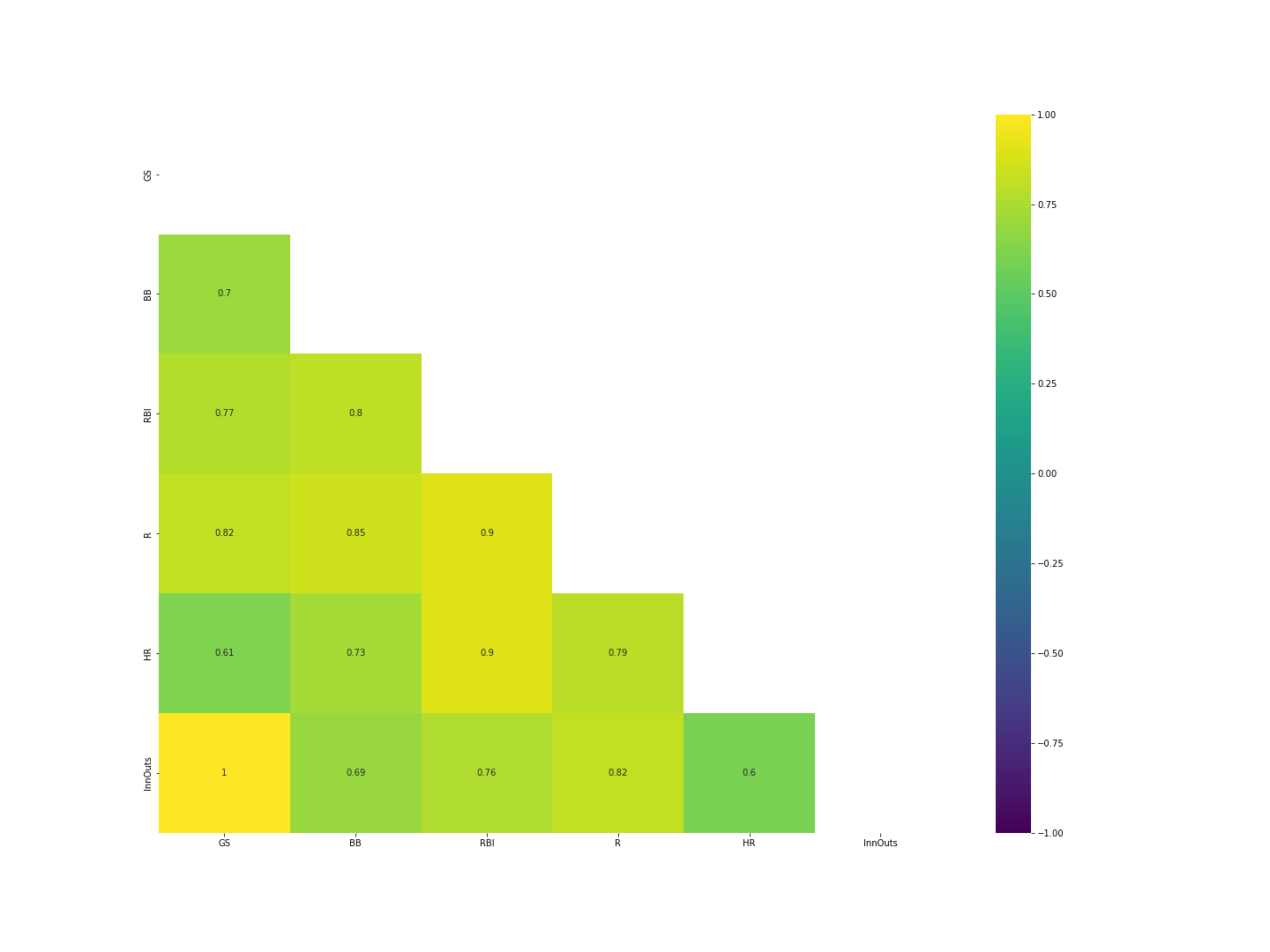
Correlation matrix analysis revealed that the offensive features were more highly correlated with our dependent variable than any of the other features in the dataset, so we focused our efforts there. GS (games started), BB (walks), RBI (runs batted in), R (runs scored), HR (home runs), and InnOuts (inning outs, a measure of game time played) were the highest-correlated with ADJ Salary.
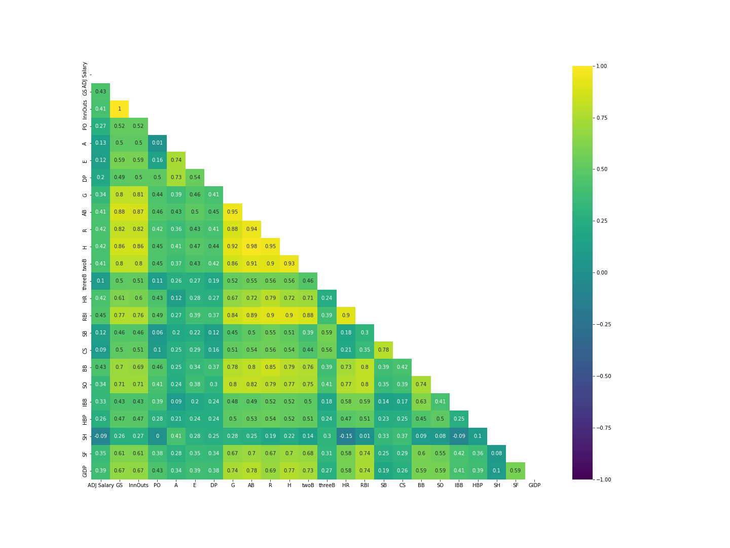
Oh no, we have a LOT of collinearity here in our independent variables!
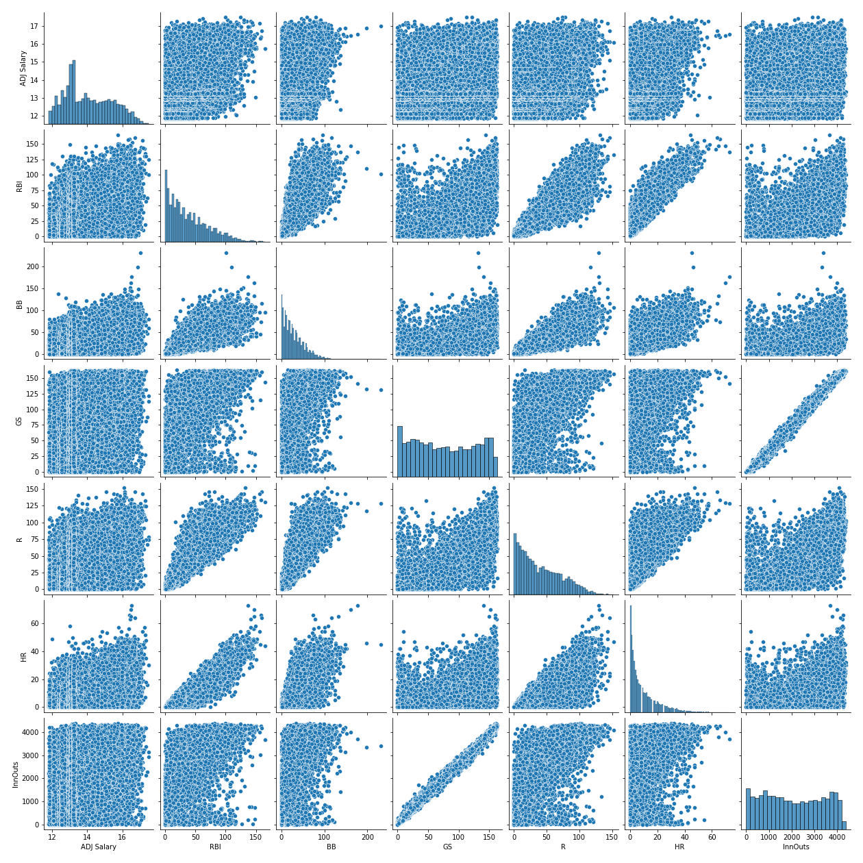
We looked at scatter plots of each of these variables against ADJ Salary. Nothing but a Jackson Pollock-like spray of dots … no linear relationships here, unfortunately. Despite all of the collinearity we need to pick a subset of these independent variables, but which ones? We picked the top 6 based on highest correlation with our target (ADJ Salary): GS, BB, RBI, R, HR, InnOuts.